
Input Builder
Actions/Triggers in plugins require an input form because they always need a way for users to send data to your app’s API to find, update, or create a new object. When building a plugin action or trigger on the Platform viaSocket, use the JSON or GUI to create the user input form for your app's API.
JSON (JavaScript Object Notation) : When building a plugin, JSON is used to define the structure and behavior of forms that users interact with.
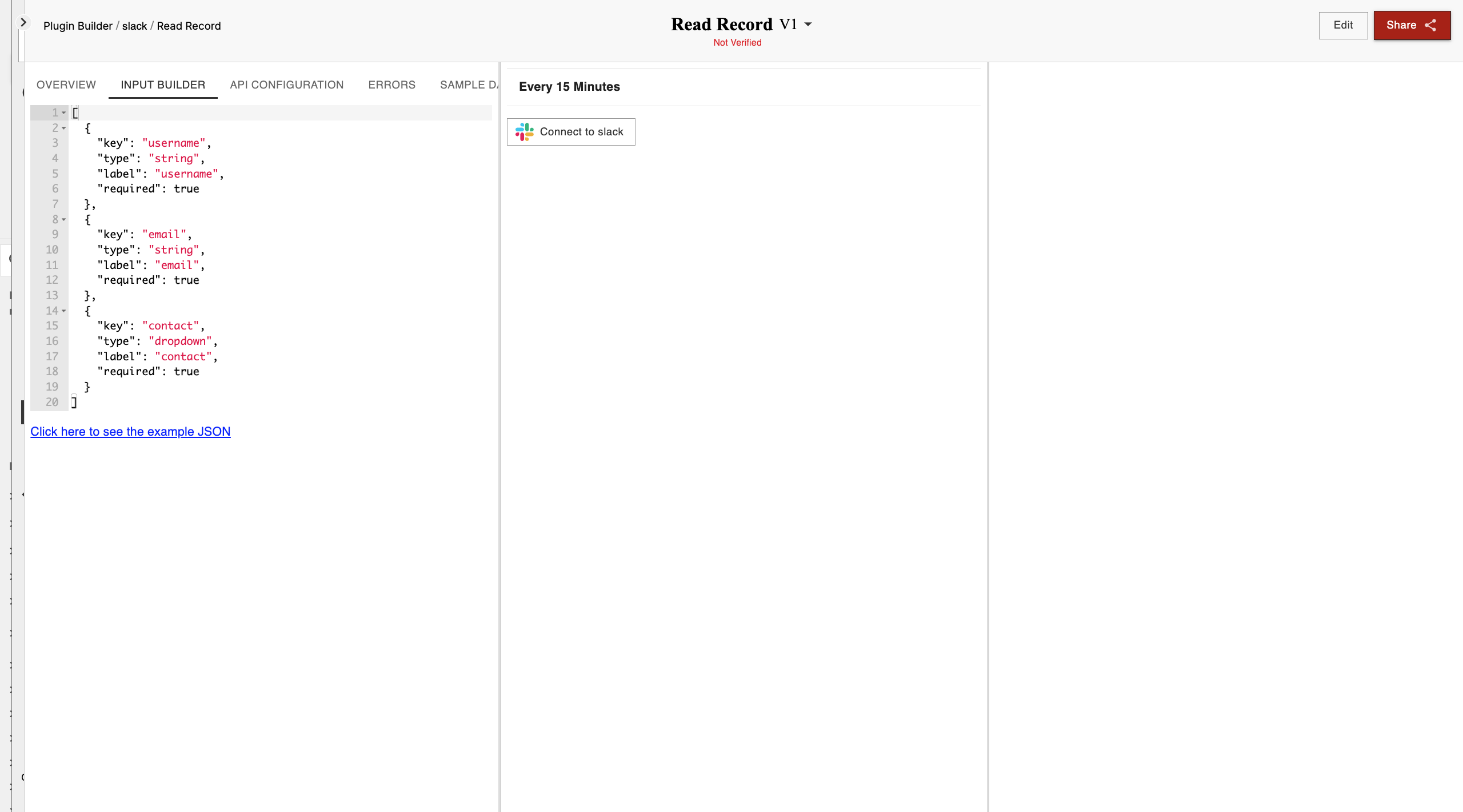
In the Form editor, add in details about your input field:
Key: A unique identifier used to reference a specific item, object, or field in a system.
Value: The data or information associated with a specific key or field.
Help: Information or instructions provided to assist the user in understanding or using a feature.
Type: Specifies the data type or format expected for a given field or value (e.g., string, number, boolean).
Required: Indicates that a field must be filled or a value must be provided for the process to continue.
optionsGenerator: A function or method that dynamically generates a list of options for a given field based on certain conditions or logic.
Fields: Individual elements or components in a form or system that collect or display data (e.g., text boxes, checkboxes).
List: A collection or array of items, typically displayed in a sequential or organized format.
Placeholder: Text or value displayed in a form field as a hint or example of what information is expected.
VisibilityCondition: A rule or condition that determines whether a particular field or element is visible to the user.
customInputLabel: A custom label or text displayed beside an input field, describing what data the user should enter.
customPlaceholder: A customized placeholder text that provides more specific guidance or information in a form field.
defaultValue: The initial value that a field or input element will have before the user interacts with it.